Overview
Flint is a digital banking product from San Francisco. The goal was simple to say and hard to do: every account, card and asset in one place, without the clutter of a traditional bank app.
My role
I led the product design on my own, from the brand foundations and type system to the component library and the iOS screens.
What I designed
Brand identity: logo, colour, type pairing (Space Grotesk and Schibsted Grotesk)
Design foundations and a reusable component library
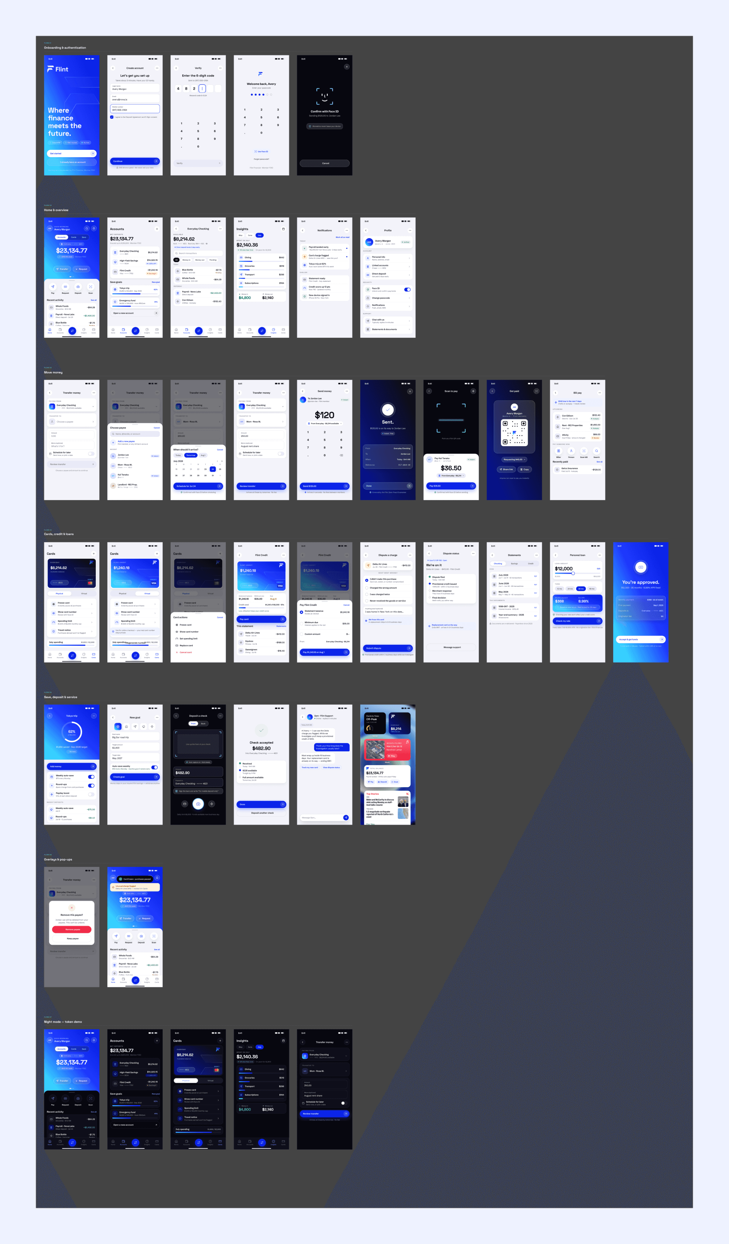
iOS app screens: home, balances, transfers, cards and settings
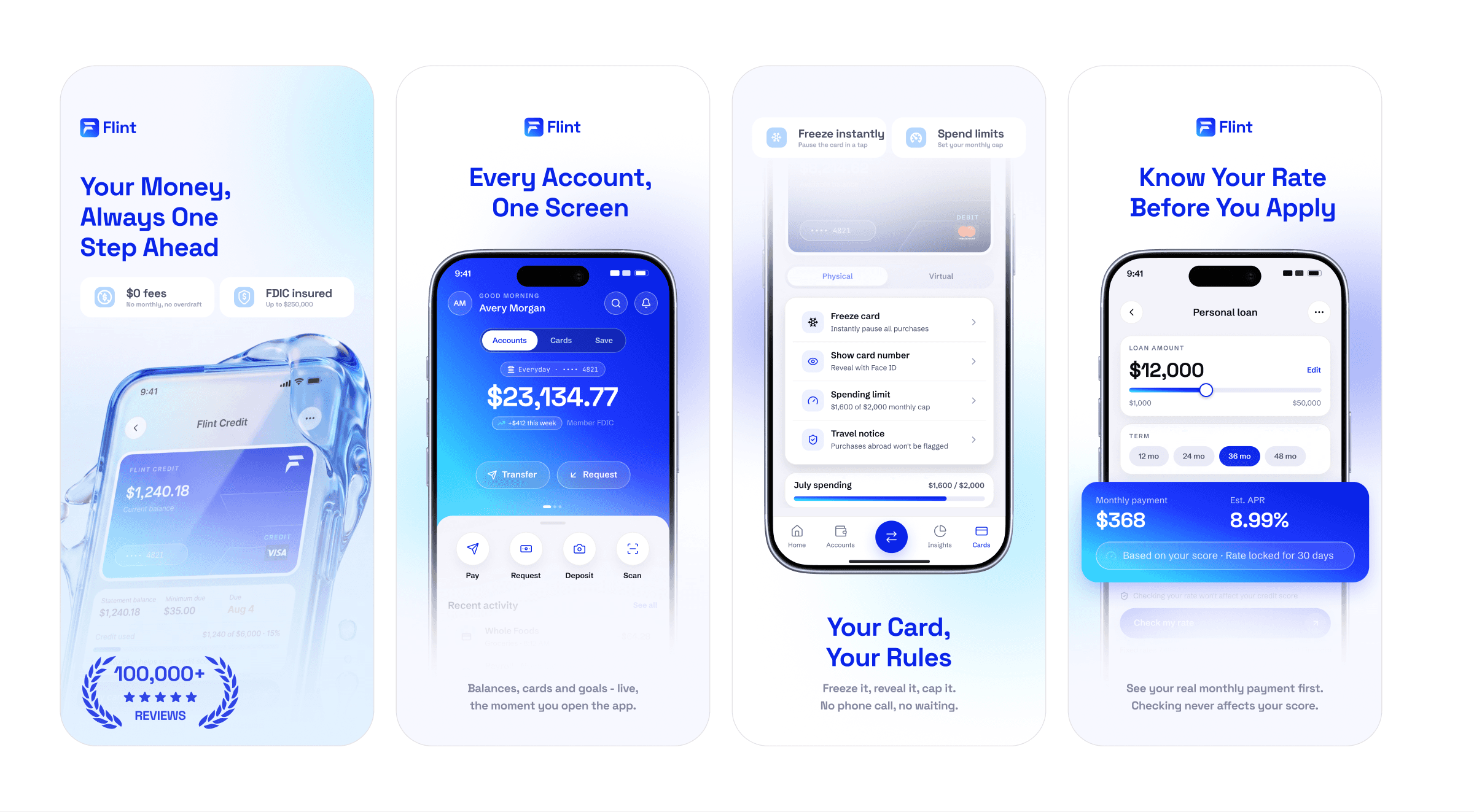
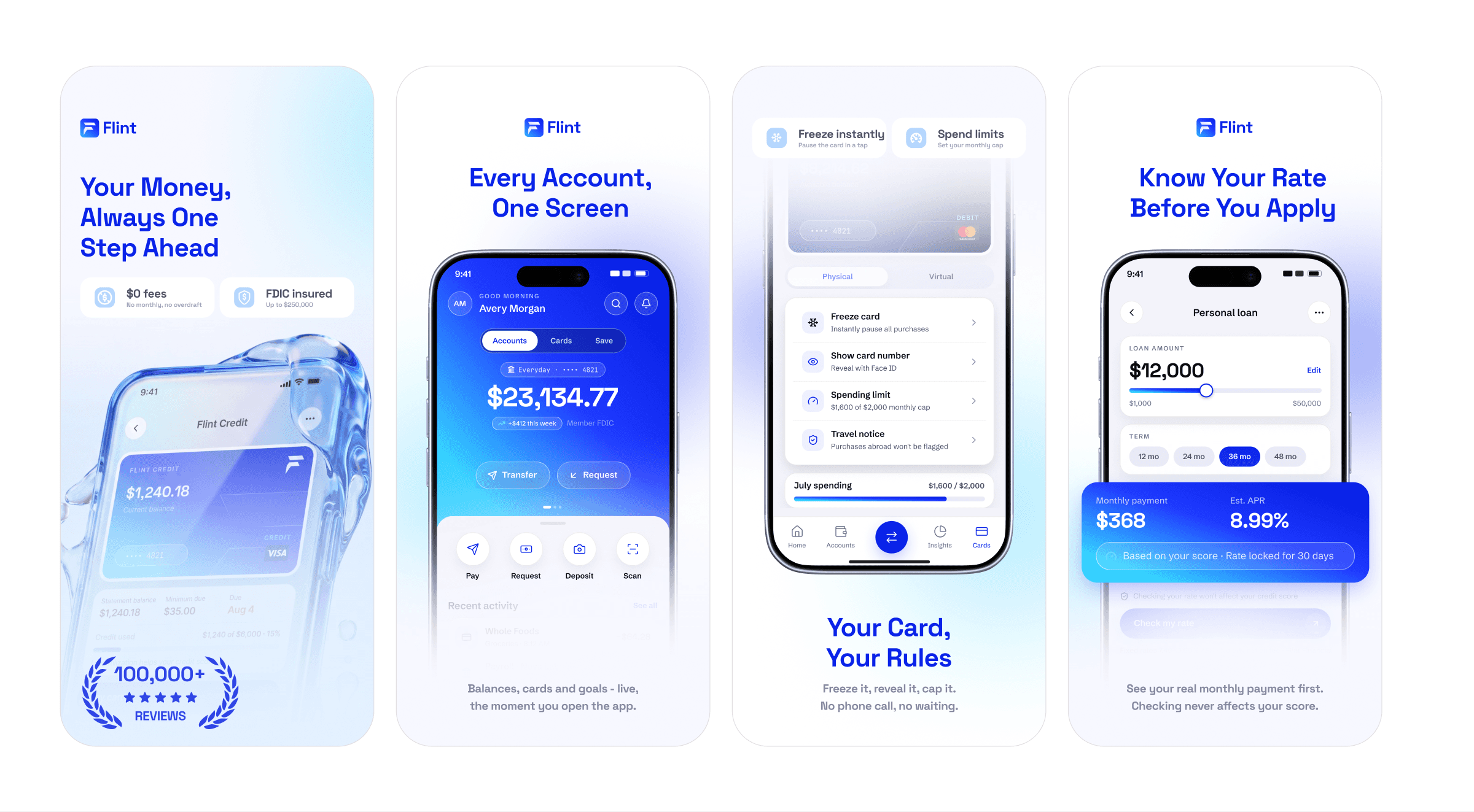
App Store and marketing visuals
Approach
I kept the interface calm and confident. One strong blue, generous spacing and clear number hierarchy so balances read at a glance. Every screen is built from the same components, which keeps the app consistent as it grows.